七、CSS动画+水平垂直居中的方案+vertical-align
# 1、transform属性
# 1.1.transform的了解
- CSS transform属性允许对某一个元素进行某些形变, 包括旋转,缩放,倾斜或平移等。
- transform是形变的意思,transformer就是变形金刚;
- 注意事项:并非所有的盒子都可以进行transform的转换(通常行内级元素不能进行形变)
- 所以,transform对于行内级非替换元素是无效的;
- 比如对span、a元素等;
# 1.2.transform的用法
- transform属性的语法如下:
none | <transform-list>
where
<transform-list> = <transform-function>+

where
<transform-function> = <matrix()> | <translate()> | <translateX()> | <translateY()> | <scale()> | <scaleX()> | <scaleY()> | <rotate()> | <skew()> | <skewX()> | <skewY()> | <matrix3d()> | <translate3d()> | <translateZ()> | <scale3d()> | <scaleZ()> | <rotate3d()> | <rotateX()> | <rotateY()> | <rotateZ()> | <perspective()>
2
3
4
5
6
常见的函数transform function有:
- 平移:translate(x, y)
- 缩放:scale(x, y)
- 旋转:rotate(deg)
- 倾斜:skew(deg, deg)
- 更多函数可以参照该网址:transform的其他函数学习 (opens new window)
通过上面的几个函数,我们可以改变某个元素的形变
# 1.3.transform函数之:位移 - translate
平移:translate(x, y)
- 这个CSS 函数用于移动元素在平面上的位置。
- translate本身可以表示翻译的意思,在物理上也可以表示平移;
值个数
- 一个值时,设置x轴上的位移
- 二个值时,设置x轴和y轴上的位移
值类型:
- 数字:100px
- 百分比:参照元素本身( refer to the size of bounding box )
translate是translateX和translateY函数的简写。
- translate3d后续了解;
translate的百分比可以完成一个元素的水平和垂直居中:
.box {
  position:relative;
  top:50%;
  left:50%;
  transform:translate(-50%,-50%);
  width:100px;
  height:100px;
  background-color:red;
}
2
3
4
5
6
7
8
9
- translate函数相对于flex布局的兼容性会好一点点
- 不过目前flex布局已经非常普及,直接使用flex布局即可;
# 1.4.transform函数之:缩放 - scale
缩放:scale(x, y)
- scale() CSS 函数可改变元素的大小。
值个数
- 一个值时,设置x轴上的缩放
- 二个值时,设置x轴和y轴上的缩放
值类型:
- 数字:
- 1:保持不变
- 2:放大一倍
- 0.5:缩小一半
- 百分比:百分比不常用
- 数字:
scale函数时scaleX和scaleY的缩写:
- scale3d后续再了解;
# 1.5.transform函数之:旋转 - rotate
旋转:rotate(
<angle>)值个数
- 一个值时,表示旋转的角度
值类型:
- 常用单位deg:旋转的角度(degrees )
- 正数为顺时针
- 负数为逆时针
补充一:rotate函数是rotateZ函数的简写写法。
- rotate3d后续再了解;
补充二:rotate的其他单位
- 事实上rotate支持的单位是很多的;
- 度(degrees)、百分度(gradians)、弧度(radians)或圈数(turns);
# 1.6.transform函数之:倾斜-skew
倾斜:skew(x, y)
- 函数定义了一个元素在二维平面上的倾斜转换。
值个数
- 一个值时,表示x轴上的倾斜
- 二个值时,表示x轴和y轴上的倾斜
值类型:
- deg:倾斜的角度:正数为顺时针,负数为逆时针
注意:倾斜的原点受transform-origin的影响
# 1.7.transform-origin
transform-origin:设置形变的原点,
- 原点默认为元素的中心点即:transform-origin:50% 50%;
- 比如在进行scale缩放或者rotate旋转时,都会有一个原点。
一个值:
- 设置x轴的原点
两个值:
- 设置x轴和y轴的原点
值必须是
<length>:具体长度px;<percentage>:具体百分比%; 或 left, center, right, top, bottom关键字中的一个- left, center, right, top, bottom关键字
- length:从左上角开始计算
- 百分比:参考元素本身大小
# 1.8.transform设置多个值(简写)
- 前面我们看到了transform的语法,它是可以设置多个transform-function的:
- 那么就意味着,我们可以给transform设置多个形变的函数;
- 注意:如果写多个transform函数,不用简写属性,而分开来写,后面的会覆盖前面的!
- 如:transform:translate(100px) scala(0.5) rotate(45deg);
.box{
  transform:translate(100px) scala(0.5) rotate(45deg);
}
2
3
# 2、水平垂直居中总结
# 2.1.行内级元素的水平居中及垂直居中;
<!-- 当子元素是行内级元素的情况:实现子元素内容的垂直水平居中 -->
<style>
  .box {
    text-align: center;
    width: 200px;
    height: 200px;
    line-height: 200px;
    background-color: red;
  }
  .son {
    background-color: pink;
  }
</style>
<div class="box">
  <span class="son">666</span>
</div>

<!-- 当子元素是行内块级元素的情况:实现子元素垂直水平居中;
     注意:该情况子元素必须有内容且子元素的字体大小跟父元素的字体大小必须一致;
     否则垂直方向将不是居中状态(默认基线对齐的原因,下面注意1有说明)-->
<style>
  .box {
    text-align: center;
    width: 200px;
    height: 200px;
    line-height: 200px;
    background-color: red;
    /* font-size: 16px; */
  }
  .son {
    display: inline-block;
    width: 100px;
    height: 100px;
    line-height: 100px;
    /* 注意1:这里能实现垂直居中是因为 默认子元素跟父元素内容基线对齐;
    当你将值改成除基线对齐之外的另一个值,如: vertical-align: top;
    该子元素在父元素就不能垂直居中了*/
    background-color: pink;
    /* font-size: 50px; */
  }
</style>
<div class="box">
  <span class="son">666</span>
</div>
2
3
4
5
6
7
8
9
10
11
12
13
14
15
16
17
18
19
20
21
22
23
24
25
26
27
28
29
30
31
32
33
34
35
36
37
38
39
40
41
42
43
44
# 2.2.margin:0 auto;实现块级元素的水平居中
<style>
  .box {
    width: 200px;
    height: 200px;
    background-color: red;
  }
  .son {
    margin: 0 auto;
    width: 100px;
    height: 100px;
    background-color: pink;
  }
</style>
<div class="box">
  <div class="son"></div>
</div>
2
3
4
5
6
7
8
9
10
11
12
13
14
15
16
# 2.3.定位元素的水平垂直居中(前提:要实现垂直居中的定位元素必须设置宽高)
<!-- 定位元素的垂直水平居中方案(前提:要实现垂直居中的定位元素必须设置宽高) -->
<style>
  .box {
    position: relative;
    width: 200px;
    height: 200px;
    /* padding-left: 20px;
    border-top: 50px solid yellow; */
    background-color: red;
  }
  .son {
      /* 这里有一个公式:
      最近的祖先定位元素的宽度(高度) = left(top) + margin-left(margin-top) + width(height) + margin-right(margin-bottom) + right(bottom) ;
      margin的默认值是:0; 而left,top,bottom,right的默认值为auto ;
      当margin:auto; 而left,top,bottom,right的值都为0时;
      即可实现定位元素(有设置宽高)在最近的祖先定位元素中垂直水平居中  */
    position: absolute;
    left: 0;
    right: 0;
    bottom: 0;
    top: 0;
    margin:auto;
    width: 100px;
    height: 100px;
    background-color: pink;
  }
</style>
</head>
<body>
  <div class="box">
    <span class="son"></span>
  </div>
2
3
4
5
6
7
8
9
10
11
12
13
14
15
16
17
18
19
20
21
22
23
24
25
26
27
28
29
30
31
32
# 2.4.定位和transform实现垂直水平居中
<style><
  .box {
    position: relative;
    width: 200px;
    height: 200px;
    background-color: red;
  }
  .son {
    position: absolute;
    top: 50%;
    left: 50%;
    transform: translate(-50%,-50%);
    /* 在知道该元素的宽高的情况下 也可将transform: translate(-50%,-50%);换成下面的margin方案;
         但是最好还是用transform方案  */
    /* margin-top: -65px;
        margin-left: -65px; */
    width: 130px;
    height: 130px;
    background-color: pink;
  }
</style>

<div class="box">
  <div class="son"></div>
</div>
2
3
4
5
6
7
8
9
10
11
12
13
14
15
16
17
18
19
20
21
22
23
24
25
# 2.5.flex布局实现flex-item的垂直水平居中
<style>
  .box {
    display: flex;
    justify-content: center;
    align-items: center;
    width: 200px;
    height: 200px;
    background-color: red;
  }
  .son {
    width: 100px;
    height: 100px;
    background-color: pink;
  }
</style>

<div class="box">
  <span class="son"></span>
</div>
2
3
4
5
6
7
8
9
10
11
12
13
14
15
16
17
18
19
# 3、transition动画
# 3.1.认识transition动画
什么是transition动画呢?
- CSS transitions 提供了一种在更改CSS属性时控制动画速度的方法。
- 可以让CSS属性变化成为一个持续一段时间的过程,而不是立即生效的;
- 比如将一个元素从一个位置移动到另外一个位置,默认在修改完CSS属性后会立即生效;
- 但是我们可以通过CSS transition,让这个过程加上一定的动画效果,包括一定的曲线速率变化;
通常将两个状态之间的过渡称为隐式过渡(implicit transitions),因为开始与结束之间的状态由浏览器决定。
- 解释:CSS转换(transition)告诉浏览器绘制初始和最终之间的中间状态,向用户显示平滑过渡
CSS transitions 可以决定
- 哪些属性发生动画效果 (明确地列出这些属性)
- 何时开始 (设置 delay)
- 持续多久 (设置 duration)
- 如何动画 (定义timing function,比如匀速地或先快后慢)
# 3.2.哪些CSS属性可以做动画呢?
并非所有的CSS属性都可以执行动画的,那么我们如何知道哪些属性支持动画呢?
方法一:在MDN可执行动画的CSS属性中查询 查询哪些CSS属性可以做动画 (opens new window)
方法二:阅读CSS属性的文档说明的 这一项:Animation type, 如下color的文档说明:
| 初始值 (opens new window) | transparent |
|---|---|
| 适用元素 | all elements. It also applies to ::first-letter (opens new window) and ::first-line (opens new window). |
| 是否是继承属性 (opens new window) | 否 |
| 计算值 (opens new window) | computed color |
| Animation type | a color (opens new window) |
# 3.3.过渡动画 - transition简写属性
- transition CSS 属性是 transition-property,transition-duration,transition-timing-function 和 transition-delay 的一个简写属性。
<single-transition>#where
<single-transition> = [ none | <single-transition-property> ] || <time> || <easing-function> || <time>
2
transition-property:指定应用过渡属性的名称
- all:所有属性都执行动画;
- none:所有属性都不执行动画;
- CSS属性名称:要执行动画的CSS属性名称,比如width、left、transform等;
transition-duration:指定过渡动画所需的时间
- 单位可以是秒(s)或毫秒(ms)
transition-timing-function:指定动画的变化曲线
transition-delay:指定过渡动画执行之前的等待时间
# 3.4.几个英语词汇的区分
transform是形变:
- 一个CSS属性,该CSS属性用于设置形变;
- 后面的值是形变的函数,比如scale、rotate、translate;
translate是其中一个transform-function
- 用于对元素进行平移;
transition是过渡的意思
- 它本身也有转变的含义,但是更多表示的是过渡的过程;
# 4、animation动画
# 4.1.认识CSS Animation
之前我们学习了transition来进行过渡动画,但是过渡动画有如下的缺点:
- transition只能定义开始状态和结束状态,不能定义中间状态,也就是说只有两个状态;
- transition不能重复执行,除非一再触发动画;
- transition需要在特定状态下会触发才能执行,比如某个属性被修改了;
如果我们希望可以有更多状态的变化,我们可以使用CSS Animation。
CSS Animation的使用分成两个步骤:
- 步骤一:使用keyframes定义动画序列(每一帧动画如何执行)
- 步骤二:配置动画执行的名称、持续时间、动画曲线、延迟、执行次数、方向等等
# 4.2.@keyframes规则
可以使用@keyframes来定义多个变化状态,并且使用animation-name来声明匹配:
- 关键帧使用percentage来指定动画发生的时间点;
- 0%表示动画的第一时刻,100%表示动画的最终时刻;
- 因为这两个时间点十分重要,所以还有特殊的别名:from和to;
也就是说可以使用from和to关键字:
- from相当于0%
- to相当于100%
<style>
  .box {
    background-color: red;
    width: 50px;
    height: 50px;
    animation: bigAnim 2s ease 1000ms 3 forwards;
    /* 表示bigAnim动画执行持续时间2s;变化曲线:ease;动画延迟100ms执行;执行3次;执行3次后停在动画最后一帧的位置 即to的位置 */
  }
  @keyframes bigAnim {
    form {
      width: 60px;
    }
    50% {
      width: 70px;
    }
    to {
      width: 100px;
    }
  }
</style>
<div class="box"></div>
2
3
4
5
6
7
8
9
10
11
12
13
14
15
16
17
18
19
20
21
# 4.3.animation属性
CSS animation 属性是 animation-name,animation-duration, animation-timing-function,animation-delay,animation-iteration-count,animation-direction,animation-fill-mode 和 animation-play-state 属性的一个简写属性形式。
animation-name:指定执行哪一个关键帧动画
animation-duration:指定动画的持续时间
animation-timing-function:指定动画的变化曲线
animation-delay:指定延迟执行的时间
animation-iteration-count:指定动画执行的次数,执行infinite表示无限动画
animation-direction:指定方向,常用值normal和reverse
animation-fill-mode:执行动画最后保留哪一个值
- none:回到没有执行动画的位置
- forwards:动画最后一帧的位置
- backwards:动画第一帧的位置
animation-play-state:指定动画运行或者暂停(在JavaScript中使用,用于暂停动画)
- running:当前动画正在运行。
- paused:当前动画已被停止。
# 5、vertical-align的深入
# 5.1.深入理解vertical-align – 行盒line boxes
官方文档的翻译:vertical-align会影响 行内块级元素 在一个 行盒 中垂直方向的位置
思考:一个div没有设置高度的时候,会不会有高度?
- 没有内容,没有高度
- 有内容,内容撑起来高度
但是内容撑起来高度的本质是什么呢?
- 内容有行高(line-height),撑起来了div的高度
行高为什么可以撑起div的高度?
- 这是因为line boxes(行盒)的存在,并且line-boxes有一个特性,包裹每行的inline level(内联级)
- 而其中的文字是有行高的,必须将整个行高包裹进去,才算包裹这个line-level
那么,进一步思考:
- 如果这个div中有图片,文字,inline-block,甚至他们设置了margin这些属性呢?
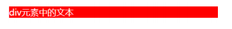
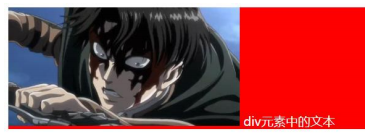
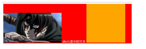
# 5.2.深入理解vertical-align – 不同情况分析
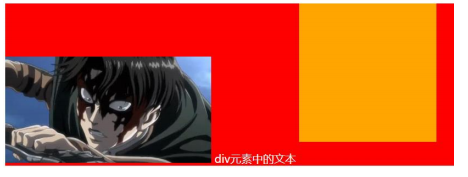
- 情况一:只有文字时,line boxes如何包裹内容?(注意:红色是包裹的div,下面也都一样)
- 情况二:有图片,有文字时,line-boxes如何包裹内容?
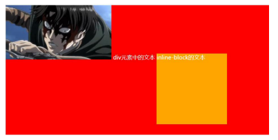
- 情况三:有图片,有文字,有inline-block(比图片要大)如何包裹内容
- 情况四:有图片,有文字,有inline-block(比图片要大)而且设置了margin-bottom,如何包裹内容?
- 情况五:有图片、文字、inline-block(比图片要大)而且设置了margin-bottom并且有文字,如何包裹内容?
# 5.3.vertical-align的baseline
结论:line-boxes一定会想办法包裹住当前行中所有的内容。
但是,但是为什么对齐方式千奇百怪呢?
- 你认为的千奇百怪,其实有它的内在规律
- 答案就是baseline对齐
我们来看官方vertical-align的默认值:没错,就是baseline
| 初始值 (opens new window) | baseline |
|---|---|
| Animation type | a length (opens new window) |
- 但是baseline都是谁呢?
- 文本的baseline是字母x的下方
- Inline-block默认的baseline是margin-bottom的底部(没有,就是盒子的底部)
- Inline-block有文本时,baseline是最后一行文本的x的下方
# 5.4.vertical-align的其他值
现在,对于不同的取值就非常容易理解了
- baseline(默认值):基线对齐(你得先明白什么是基线)
- top:把行内级盒子的顶部跟line boxes顶部对齐
- middle:行内级盒子的中心点与父盒基线加上x-height一半的线对齐
- bottom:把行内级盒子的底部跟line box底部对齐
<percentage>:把行内级盒子提升或者下降一段距离(距离相对于line-height计算\元素高度), 0%意味着同baseline一 样<length>:把行内级盒子提升或者下降一段距离,0cm意味着同baseline一样
解决图片下边缘的间隙方法:
- 方法一: 设置成top/middle/bottom
- 方法二: 将图片设置为block元素