六、CSS的flex布局
# 1、认识flexbox(弹性布局)
Flexbox翻译为弹性盒子:
- 弹性盒子是一种用于按行或按列布局元素的一维布局方法 ;
- 元素可以膨胀以填充额外的空间, 收缩以适应更小的空间;
- 通常我们使用Flexbox来进行布局的方案称之为flex布局(flex layout);
flex布局是目前web开发中使用最多的布局方案:
- flex 布局(Flexible 布局,弹性布局);
- 目前特别在移动端可以说已经完全普及;
- 在PC端也几乎已经完全普及和使用, 只有非常少数的网站依然在用浮动来布局;
为什么需要flex布局呢?
- 长久以来,CSS 布局中唯一可靠且跨浏览器兼容的布局工具只有 floats 和 positioning。
- 但是这两种方法本身存在很大的局限性, 并且他们用于布局实在是无奈之举;
# 2、原先的布局存在的痛点
- 原来的布局存在哪些痛点呢? 举例说明:
- 比如在父内容里面垂直居中一个块内容。
- 比如使容器的所有子项等分可用宽度/高度,而不管有多少宽度/高度可用。
- 比如使多列布局中的所有列采用相同的高度,即使它们包含的内容量不同。
# 3、flex布局的重要概念及布局模型
# 3.1.flex布局的重要概念
两个重要的概念:
- 开启了 flex 布局的元素叫 flex container
- flex container 里面的直接子元素叫做 flex item
当flex container中的子元素变成了flex item时, 具备一下特点:
- flex item的布局将受flex container属性的设置来进行控制和布局;
- flex container,flex item不再严格区分块级元素和行内级元素;
- flex item默认情况下是包裹内容的, 但是可以设置宽度和高度;
设置 display 属性为 flex 或者 inline-flex 可以成为 flex container
- flex: flex container 以 block-level 形式存在
- inline-flex: flex container 以 inline-level 形式存在
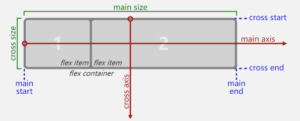
# 3.2.flex的布局模型
- main axis是主轴方向; cross axis 是交叉轴方向
- main start (cross start) 是 主轴 (交叉轴) 开始位置;
- main end (cross end) 是 主轴 (交叉轴) 结束位置
- main size 是主轴元素内容长度; cross size 是交叉轴元素内容长度
- flex container 为开启弹性布局的元素内容; flex item 是开启弹性布局元素的子元素
# 4、flex相关的属性
- 应用在flex container 上的CSS属性
- flex-direction:决定主轴(main axis)的方向
- flex-wrap:决定flex container 是单行排列 还是 多行排列
- flex-flow:是 flex-direction 和 flex-wrap 的简写
- justify-content:决定了 (多列)flex items在 主轴(main axis) 上的对齐方式
- align-items:决定了 flex items 在 交叉轴(cross axis) 上的对齐方式
- align-content:决定了多行 flex items 在 交叉轴(cross axis) 上的对齐方式,用法与 justify-content 类似
- 应用在flex items 上的CSS属性
- order:决定了flex items 的排布顺序
- align-self:设置该属性可覆盖flex container 设置的align-items
- flex-grow:决定了 flex items 如何扩展(拉伸/成长)
- flex-shrink:决定了 flex items 如何收缩(缩小)
- flex-basis:用来设置 flex items 在 main axis 方向上的 基本尺寸(base size)
- flex: 是 flex-grow || flex-shrink || flex-basis 的简写,flex 属性可以指定1个,2个或3个值。
# 5、flex container 上的CSS属性
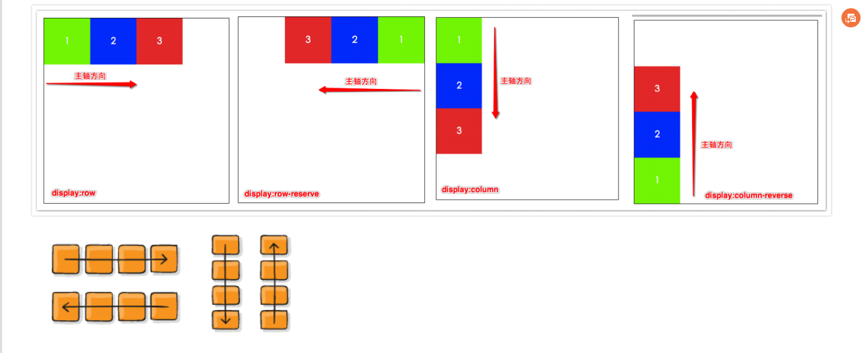
# 5.1.flex-direction
- flex items 默认都是沿着 main axis(主轴)从 main start 开始往 main end 方向排布
- flex-direction 决定了 main axis 的方向,有 4 个取值
- row(默认值)
- row-reverse
- column
- column-reverse
# 5.2.flex-wrap
- flex-wrap 决定了 flex container 是单行还是多行
- nowrap(默认):单行
- wrap:多行
- wrap-reverse:多行(对比 wrap,cross start 与 cross end 相反)
# 5.3.flex-flow
- flex-flow 属性是 flex-direction 和 flex-wrap 的简写。
- 顺序任何, 并且都可以省略;
<'flex-direction'> || <'flex-wrap'>
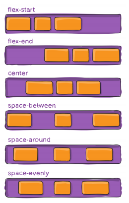
# 5.4.justify-content
justify-content 决定了 flex items 在 主轴(main axis) 上的对齐方式;属性值如下:
flex-start(默认值):与 main start 对齐
flex-end:与 main end 对齐
center:居中对齐
space-between:
- flex items 之间的距离相等
- 与 main start、main end两端对齐
space-around:
- flex items 之间的距离相等
- flex items 与 main start、main end 之间的距离是 flex items 之间距离的一半
space-evenly:
- flex items 之间的距离相等
- flex items 与 main start、main end 之间的距离 等于 flex items 之间的距离
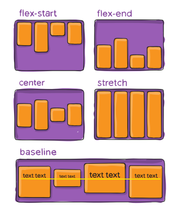
# 5.5.align-item
align-items 决定了 flex items 在 cross axis 上的对齐方式;属性值如下:
- normal(默认值):在弹性布局中,效果和stretch一样
- stretch:当 flex items 在 cross axis 方向的 size 为 auto 时,会自动拉伸至填充 flex container
- flex-start:与 cross start 对齐
- flex-end:与 cross end 对齐
- center:居中对齐
- baseline:与基准线对齐
# 5.6.align-content
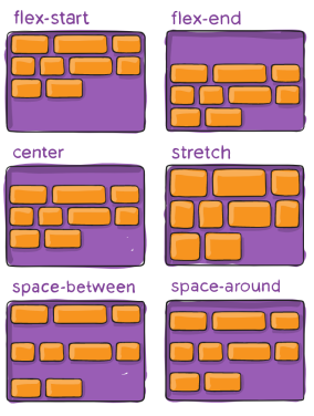
align-content 决定了多行 flex items 在 交叉轴(cross axis) 上的对齐方式,用法与 justify-content 类似;属性值如下:
stretch(默认值):与 align-items 的 stretch 类似(当 flex items 在 cross axis 方向的 size 为 auto 时,会自动拉伸至填充 flex container)
flex-start:与 cross start 对齐
flex-end:与 cross end 对齐
center:居中对齐
space-between:
- flex items 之间的距离相等
- 与 cross start、cross end两端对齐
space-around:
- flex items 之间的距离相等
- flex items 与 cross start、cross end 之间的距离是 flex items 之间距离的一半
space-evenly:
- flex items 之间的距离相等
- flex items 与 cross start、cross end 之间的距离 等于 flex items 之间的距离
# 6、flex items 上的CSS属性
# 6.1. order属性
- order 决定了 flex items 的排布顺序
- 可以设置任意整数(正整数、负整数、0),值越小就越排在前面
- 默认值是 0
# 6.2.align-self属性
- flex items 可以通过 align-self 覆盖 flex container 设置的 align-items
- auto(默认值):遵从 flex container 的 align-items 设置
- stretch:当 flex items 在 cross axis 方向的 size 为 auto 时,会自动拉伸至填充 flex container
- flex-start:与 cross start 对齐
- flex-end:与 cross end 对齐
- center:居中对齐
- baseline:与基准线对齐

# 6.3.flex-grow属性
flex-grow 决定了 flex items 如何扩展(拉伸/成长)
- 可以设置任意非负数字(正小数、正整数、0),默认值是 0
- 当 flex container 在 main axis 方向上有剩余 size 时,flex-grow 属性才会有效
如果所有 flex items 的 flex-grow 总和 sum 超过 1,每个 flex item 扩展的 size 为flex container 的剩余 size * flex-grow / sum
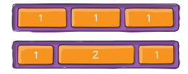
- flex items 扩展后的最终 size 不能超过 max-width\max-height
# 6.4.flex-shrink属性
flex-shrink 决定了 flex items 如何收缩(缩小)
- 可以设置任意非负数字(正小数、正整数、0),默认值是 1
- 当 flex items 在 main axis 方向上超过了 flex container 的 size,flex-shrink 属性才会有效
如果所有 flex items 的 flex-shrink 总和超过 1,每个 flex item 收缩的 size为flex items 超出 flex container 的 size * 收缩比例 / 所有 flex items 的收缩比例之和
flex items 收缩后的最终 size 不能小于 min-width\min-height
# 6.5.flex-basis属性
flex-basis 用来设置 flex items 在 main axis 方向上的 基本尺寸(base size)
- auto(默认值):长度等于灵活项目的长度。如果该元素未指定长度,则长度将根据内容决定。 如果该元素指定了width,则按照指定的width显示
- content:自动尺寸,即使元素设置了width,也不按照指定的width显示,而是根据自动尺寸进行显示(浏览器自动根据元素中的内容来决定分配尺寸的大小)
- 或者 具体的宽度数值(100px)
决定 flex items 最终 base size 的因素,从优先级高到低
- max-width\max-height\min-width\min-height
- flex-basis
- width\height
- 内容本身的 size
<!DOCTYPE html>
<html lang="en">

<head>
  <meta charset="UTF-8">
  <meta http-equiv="X-UA-Compatible" content="IE=edge">
  <meta name="viewport" content="width=device-width, initial-scale=1.0">
  <title>Document</title>
  <style>
    .content {
      display: flex;
    }

    .content .box {
      /* 这里可以证明出它们的优先级关系(如下从高到低)
      - max-width\max-height\min-width\min-height
      - flex-basis
      - width\height
      - 内容本身的 size
      */
      max-width: 100px;
      flex-basis: 120px;
      width: 100px;
      height: 50px;
      background-color: red;
    }

    .content .bar {
      /* flex-basis使用时具体的区别:在英文语句下;
         如下Juliette_container_hahaha是一个单词过长的情况,
         如果发现盒子宽度不够显示该单词,会自动扩展盒子的宽度*/
      flex-basis: 100px;/* 该情况下盒子宽度自动扩展到197.25px */
      /* width: 100px; */  /* 该情况下盒子宽度依然为100px */
      height: 50px;
      background-color: pink;
    }
    .content .item {
      width: 100px;
      height: 50px;
      background-color: red;
    }
  </style>
</head>

<body>
  <div class="content">
    <div class="box">
      这是一个很nice的项目
    </div>
    <div class="bar">
      this is Juliette_container_hahaha
    </div>
    <div class="item"></div>
  </div>
</body>

</html>
2
3
4
5
6
7
8
9
10
11
12
13
14
15
16
17
18
19
20
21
22
23
24
25
26
27
28
29
30
31
32
33
34
35
36
37
38
39
40
41
42
43
44
45
46
47
48
49
50
51
52
53
54
55
56
57
# 6.6.flex属性
- flex 是 flex-grow || flex-shrink || flex-basis 的简写,flex 属性可以指定1个,2个或3个值。
none | [ <'flex-grow'> <'flex-shrink'>? || <'flex-basis'> ]
单值语法: 值必须为以下其中之一:
- 一个无单位数(
<number>): 它会被当作<flex-grow>的值。这种情况<flex-shrink>的值被假定为1,然后<flex-basis>的值被假定为0。 - 一个有效的宽度(width)值: 它会被当作
<flex-basis>的值。 - 关键字none,auto或initial;(下面:其他相关属性值了解;有详细说到)
- 一个无单位数(
双值语法: 第一个值必须为一个无单位数,并且它会被当作
<flex-grow>的值。- 第二个值必须为以下之一:
- 一个无单位数:它会被当作
<flex-shrink>的值。 - 一个有效的宽度值: 它会被当作
<flex-basis>的值。
- 一个无单位数:它会被当作
- 第二个值必须为以下之一:
三值语法:
- 第一个值必须为一个无单位数,并且它会被当作
<flex-grow>的值。 - 第二个值必须为一个无单位数,并且它会被当作
<flex-shrink>的值。 - 第三个值必须为一个有效的宽度值, 并且它会被当作
<flex-basis>的值。
- 第一个值必须为一个无单位数,并且它会被当作
其他相关属性值了解
- flex:initial;默认值;与flex:0 1 auto;相同
- flex:none;与flex:0 0 auto;相同
- flex:auto;与:flex:1 1 auto;相同
# 7、flex布局: 如下布局如何解决对其问题

- 在flex container 中加 列数(这里是6列)-2=4个 i/span元素即可解决此布局问题
- 注意:加的i/span元素需要设置跟其他flex items一样的宽度值
<!DOCTYPE html>
<html lang="en">
<head>
  <meta charset="UTF-8">
  <meta http-equiv="X-UA-Compatible" content="IE=edge">
  <meta name="viewport" content="width=device-width, initial-scale=1.0">
  <title>Document</title>
  <style>
    .box {
      display: flex;
      flex-wrap: wrap;
      justify-content: space-between;
      width: 330px;
      background-color: red;
    }
    .box .item {
      width: 50px;
      height: 50px;
      margin-top: 5px;
      background-color: pink;
    }
    .box>i {
      width: 50px;
    }
  </style>
</head>
<body>
  <div class="box">
    <div class="item">1</div>
    <div class="item">2</div>
    <div class="item">3</div>
    <div class="item">4</div>
    <div class="item">5</div>
    <div class="item">6</div>
    <div class="item">7</div>
    <div class="item">8</div>
    <div class="item">9</div>
    <div class="item">10</div>
    <!-- 添加span/i的个数是列数减-2 -->
    <i></i>
    <i></i>
    <i></i>
    <i></i>
  </div>
</body>
</html>
2
3
4
5
6
7
8
9
10
11
12
13
14
15
16
17
18
19
20
21
22
23
24
25
26
27
28
29
30
31
32
33
34
35
36
37
38
39
40
41
42
43
44
45
46